Reline UI Open-Source React Component Library
Glassmorphism and liquid motion, packaged as React components you can actually npm install.
Overview
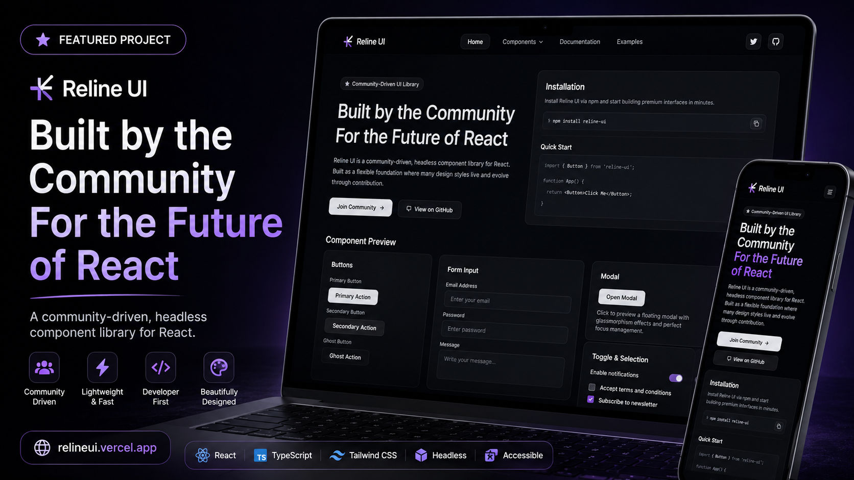
Reline UI started from the usual problem rebuilding the same buttons, accordions, and dialogs from scratch on every new project but instead of stopping at a personal snippet collection, it became a properly packaged, installable library. The visual identity was the starting point, not an afterthought: glassmorphism and liquid motion, rather than another flat or minimal component kit. The library currently covers Button (primary, secondary, outline, danger, success variants), a frosted Glass Button, Accordion and a glassmorphic Glass Accordion, Alert Dialog, Callout, Tabs, and Media Card, plus a Theme Provider, Theme Switcher, and Theme Toggle so dark mode works out of the box across every component, not bolted on per-project. Under the hood, it's plain React (no TypeScript), styled entirely through Tailwind CSS with a shared cn utility (clsx + tailwind-merge) so class overrides never fight with the base styles, animated throughout with Framer Motion, and built with Vite into tree-shakeable ES modules using named exports only, a deliberate choice for predictable imports and smaller bundles. It targets React 19+. It's released on npm and MIT-licensed, with a documented contribution workflow (component folder convention, required docs.md, a submission checklist) so outside contributors can add components without breaking the system. The reline.vercel.app site is the public showcase and install point, and a separate small app, Zeaster, exists purely to verify that each published version actually renders and behaves correctly in a real consuming project before it ships. Stack: React, JavaScript, Vite, Tailwind CSS, Framer Motion, npm, Vercel
The Pain Point
The same handful of UI primitives buttons, accordions, dialogs, tabs kept getting rebuilt from scratch on every new project, and the popular existing component libraries either didn't match the glassmorphism/motion-heavy look being aimed for, or pulled in far more dependency weight than a given project actually needed.
Problem Statement
Package a small, opinionated set of production-ready React components with a distinct glass/liquid visual identity, built on Tailwind and Framer Motion, in a way that's genuinely installable npm, tree-shakeable, named exports rather than a copy-paste snippet collection, and open enough for outside contributors to extend.
Key Features
- Component set covering buttons, glass buttons, accordions, glass accordions, alert dialogs, callouts, tabs, and media cards.
- Built-in dark mode via a Theme Provider, Theme Switcher, and Theme Toggle.
- Glassmorphism and liquid motion as the core visual identity, not a generic flat UI kit.
- Framer Motion animation on every interactive component, not just CSS transitions.
- Tailwind-first styling with a shared cn utility for safe class merging and easy overrides.
- Tree-shakeable, dependency-light ES module build via Vite.
- Named-export-only API for predictable imports and smaller bundles.
- Published and versioned on npm (reline-ui) for one-command installation.
- MIT-licensed and open to contributions, with a documented component workflow and submission checklist.
Process
- 1Defined the core visual language glassmorphism and liquid motion before touching a component checklist
- 2Set up the package with Vite, named exports only, and a shared cn utility (clsx + tailwind-merge)
- 3Built the first component set: Button, Glass Button, Accordion, Glass Accordion, Alert Dialog, Callout, Tabs, and Media Card
- 4Added a Theme Provider, Theme Switcher, and Theme Toggle so dark mode works out of the box library-wide
- 5Animated every interactive state with Framer Motion instead of relying on CSS transitions alone
- 6Documented each component's usage and props, and wrote a contribution guide with a folder-structure convention and submission checklist
- 7Published the package to npm and built the reline.vercel.app site to showcase components and installation
- 8Built Zeaster as a separate consuming app solely to verify published versions actually render and behave correctly outside the monograph.
The Outcome
A real, versioned npm package with its own landing site, install instructions, and a dedicated test app proving every release actually works turning "I built a UI library" from a portfolio line into a working open-source project other developers can install and contribute to.
My Role
Creator & Maintainer
Timeline
Ongoing
Related Work
Looking for similar work?
If you need a developer who understands your tech stack and can deliver results like this, let's talk.